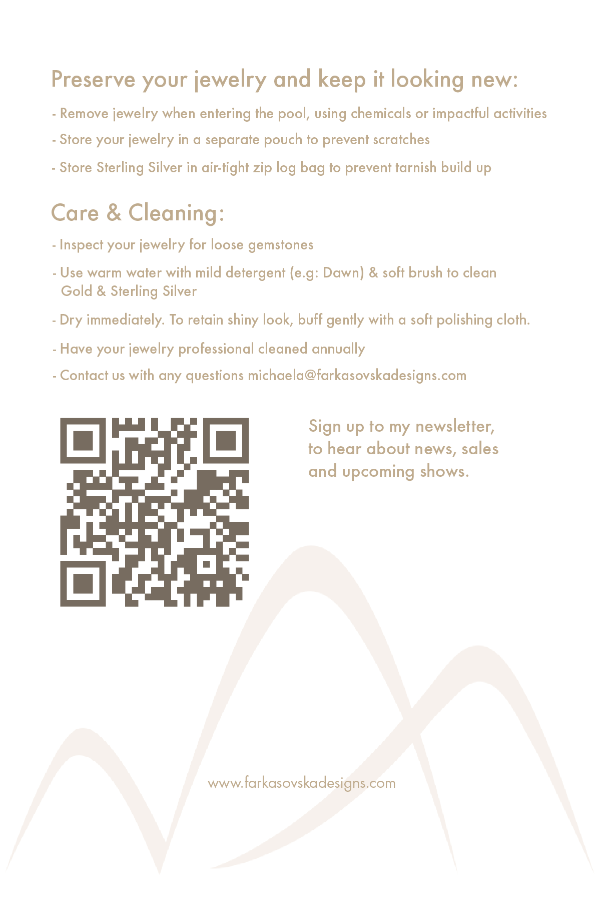
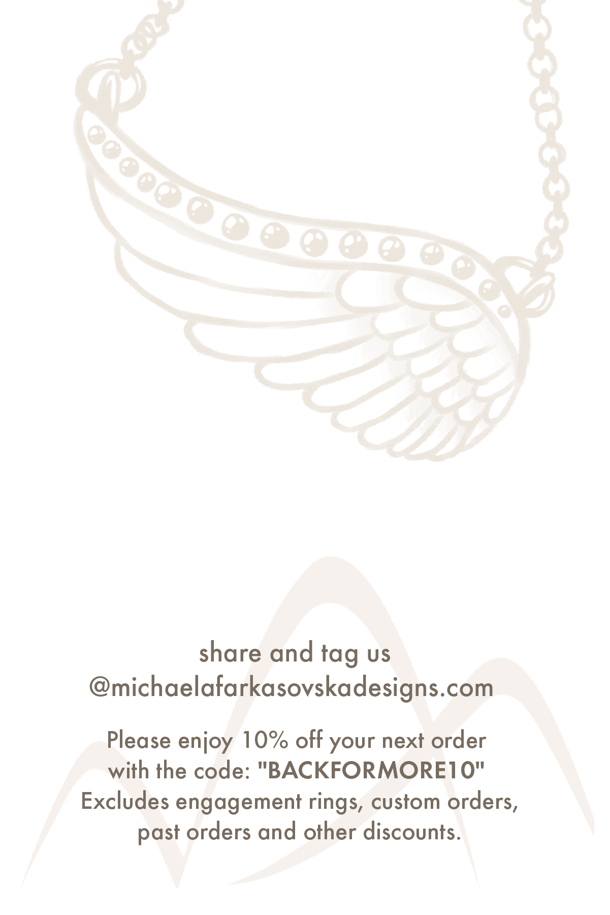
Michaela Farkasovska
Worked with Michaela to create a new business card, jewelry care card/newsletter QR code and a flyer.
Wanted a more simple design, however, wanted to add in elements of either her jewelry or what her inspiration was for her new line of jewelry, which was birds soaring and nature.


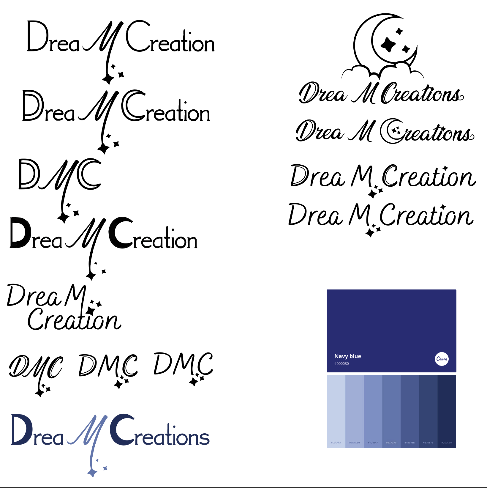
Drea Carbone
Worked with Drea to create a new logo for her new business and for socials.
Wanted a simple wordmark logo design, however, wanted to add in elements of stars and moons. Because the name Drea picked was Drea M Creations which when abbreviated to DMC are her initials. Drea supplied me with her own sketch of what she was thinking. I took what she gave me and made my own version and some other sketches so we could work together on what Drea liked and fit with her vision.
First I work on finding a type face that we both liked and would work the the drawn elements we wanted to add. We went through a few passes till we found one that worked.
Then we worked on color. Drea wanted either a charcoal or navy blue or a combination. Once we found what worked best we focused on the final details. I then made different versions of the wordmark for Drea to use on socials and web.

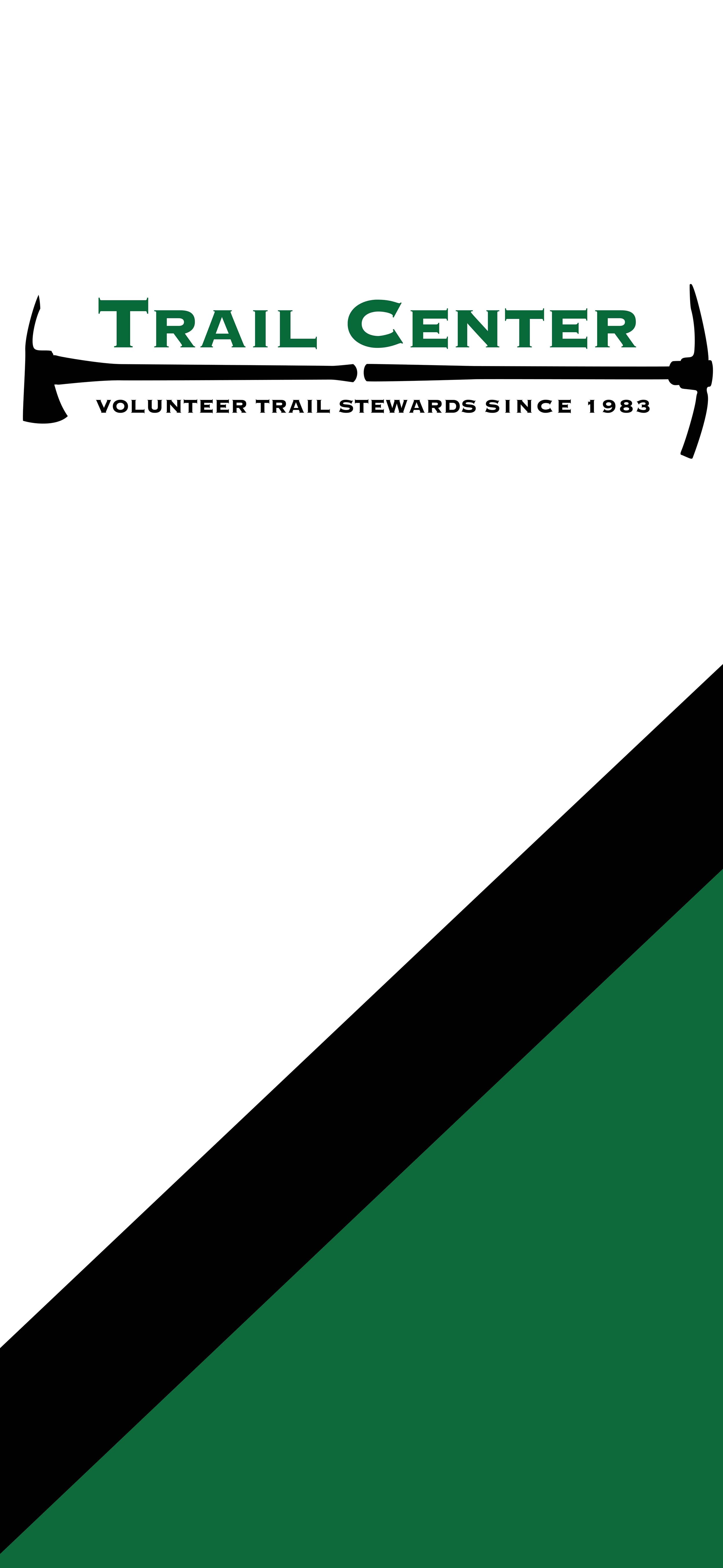

Trail Center
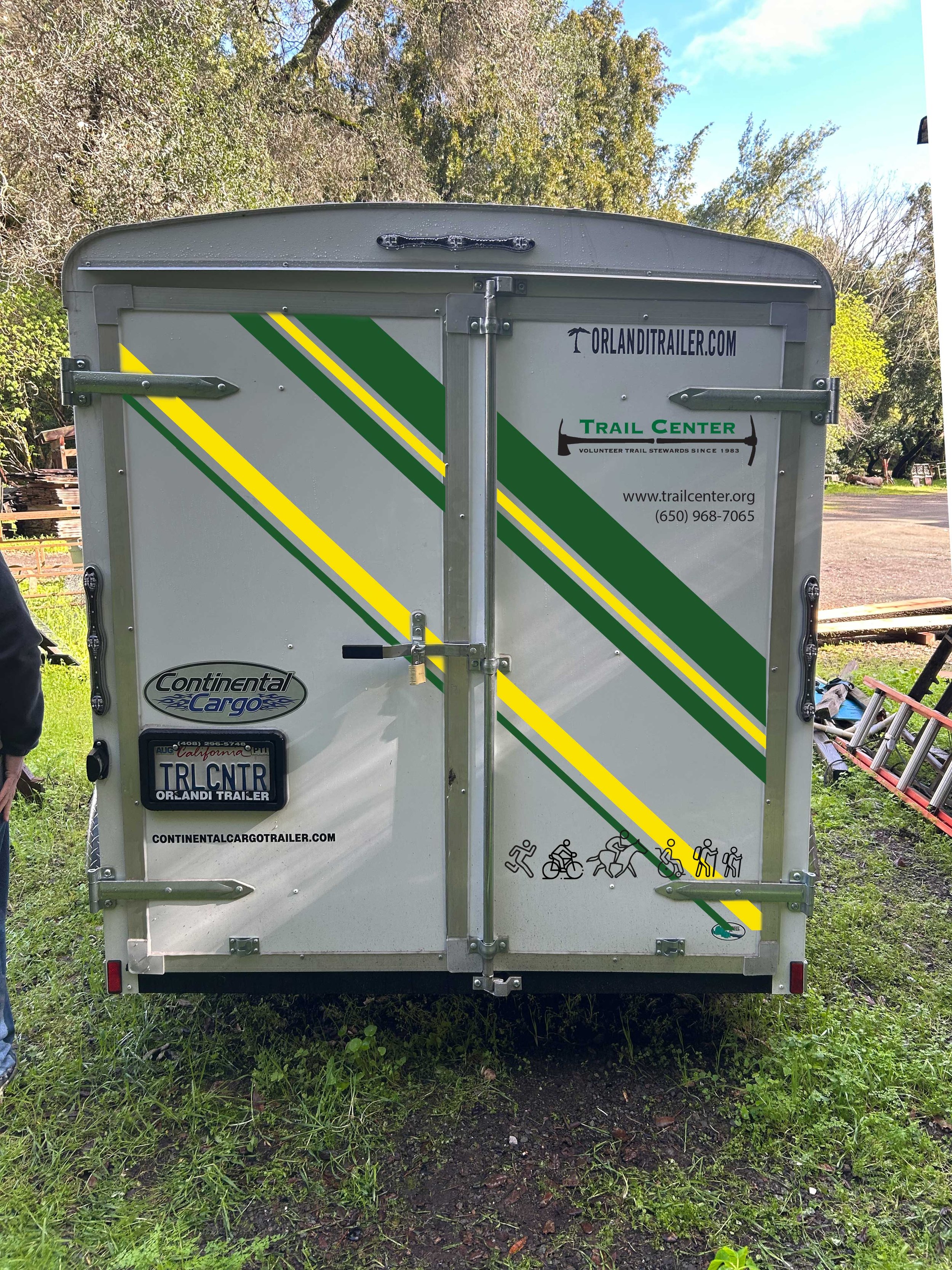
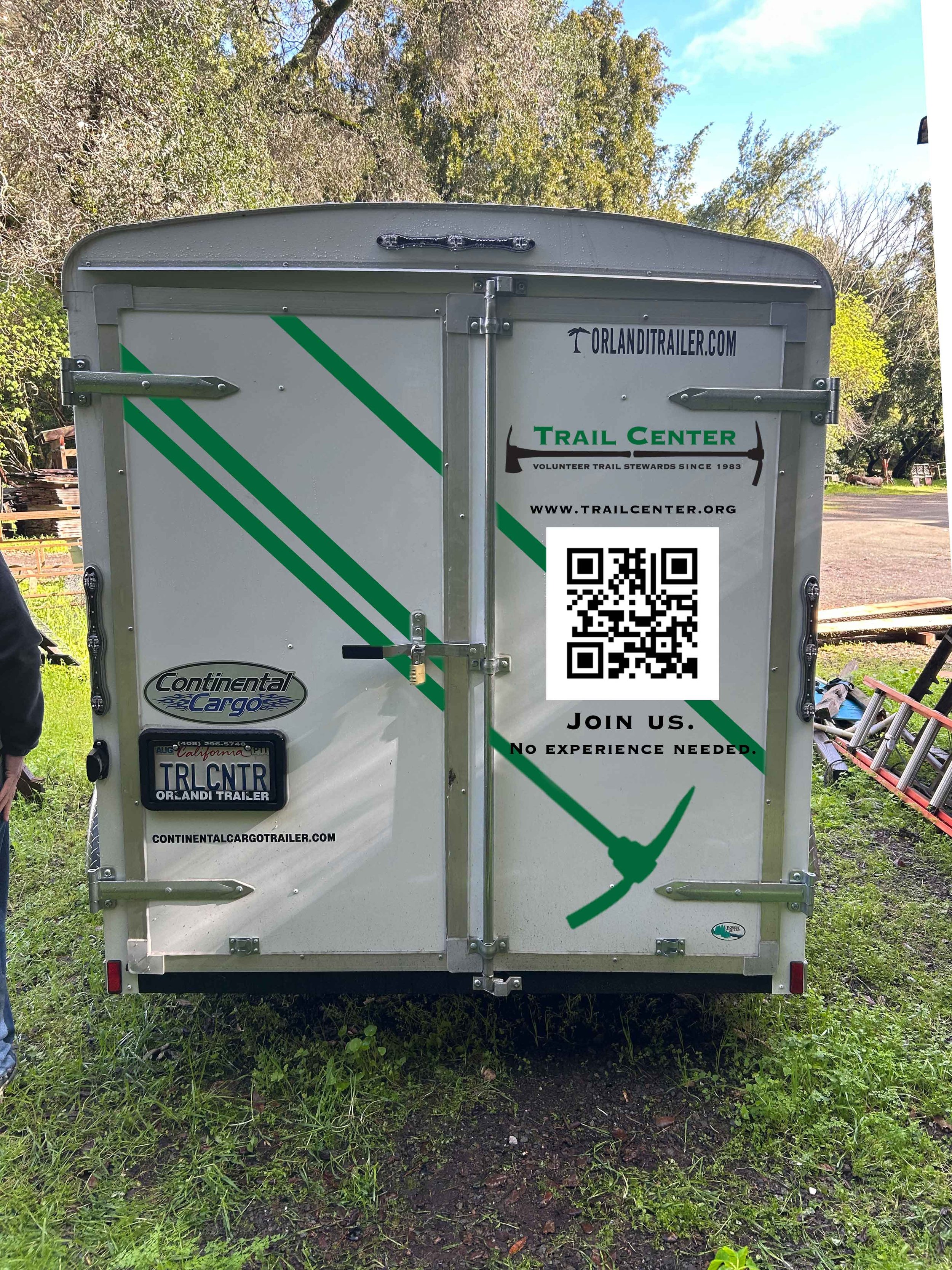
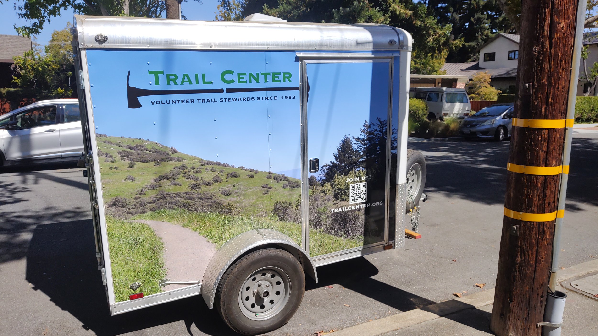
Worked with the non-profit company Trail Center to design graphics to put on their trailer that stores their equipment that they take to places to do maintenance for trails in the Bay Area of California.
Had a meeting with the people on the board of the company to get an idea of what they would like to see from the first round of designs and to ask who they are as a company and their mission so that I could make sure the essence gets carried into the designs. Get measurements of the trailer and other files that I would need for the designs.
They wanted to use a photo of one of the trails they maintenance for the sides of the trailer. Which we all decided pretty quickly. My real design challenge would be the back of the trailer. The back needed the logo, website URL, a QR code that takes people to the website and a mission statement to get volunteers to come and help while designing around the metal hinges of the back doors of the trailer.
At first I wanted to make it more simple than the sides so it didn’t over power the photo. Played with lines and blocks of color going across both doors. Then deiced to add a head of one of the tools they use during maintenance to one of the lines. They loved that idea so I ran with it and made a version where the tool became the line that split the blocks of color. And where I could spilt the logo and QR code so the design was not heavy on only one side.
The back became a bold design that did not take away from the sides of the trailer, they all worked together to show the everyday people that walk trails to see how Trail Center was and how to reach them if they ever wanted to volunteer.


Banner Design
Designed a banner for my polish church to promote our Polish festival and that it was finally back after a few years. Used a photo I had taken years ago at the same festival and also used traditional flower designs to give interest. And used red not only to tie into the Polish flag but to get peoples attention sense this banner will be put on the churches fence that faces the road.